Cliclac studio

Créateur d'identitésvisuelles singulières

Branding illustré & illustration, pour les marques qui n'ont pas peur de montrer qui elles sont.

Ce qu'on fait

Branding illustré

Une marque qui a un visage : logos, personnages, icônes et illustrations qui portent sa voix partout où elle passe.

Illustration

Du trait sur mesure pour tes campagnes, ton site, tes produits. Des images qu'on ne confond avec aucune autre.

Identité complète

Palette, typographie, ton, iconographie : un système visuel cohérent, pensé pour vivre partout, du packaging à l'Insta.

Réalisations

Un aperçu des mondes qu'on a dessinés

Le studio

Projet 01

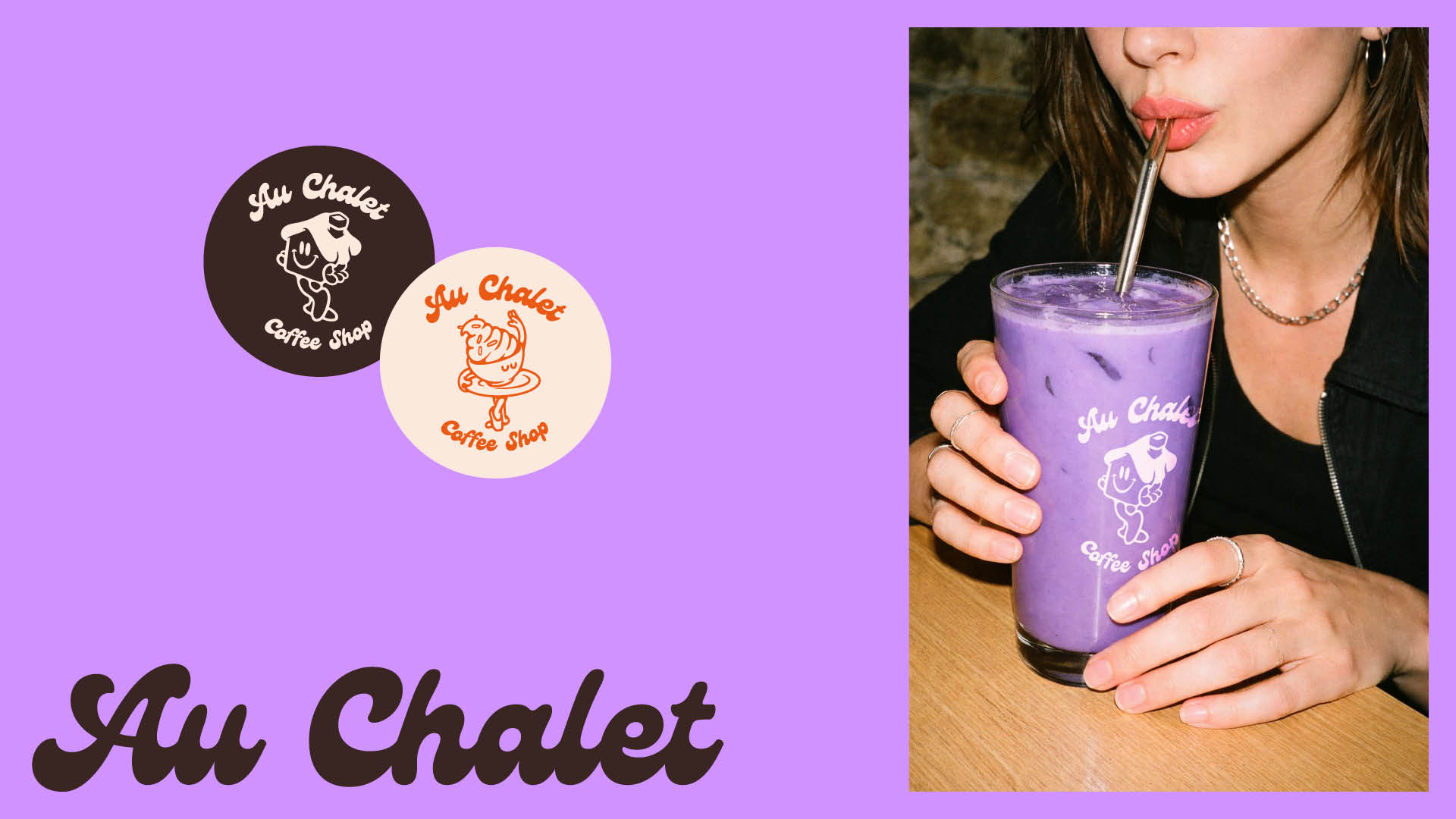
Au Chalet

Brand Identity · Restoration

Brand identity and illustration for an independent coffee shop in La Rochelle.

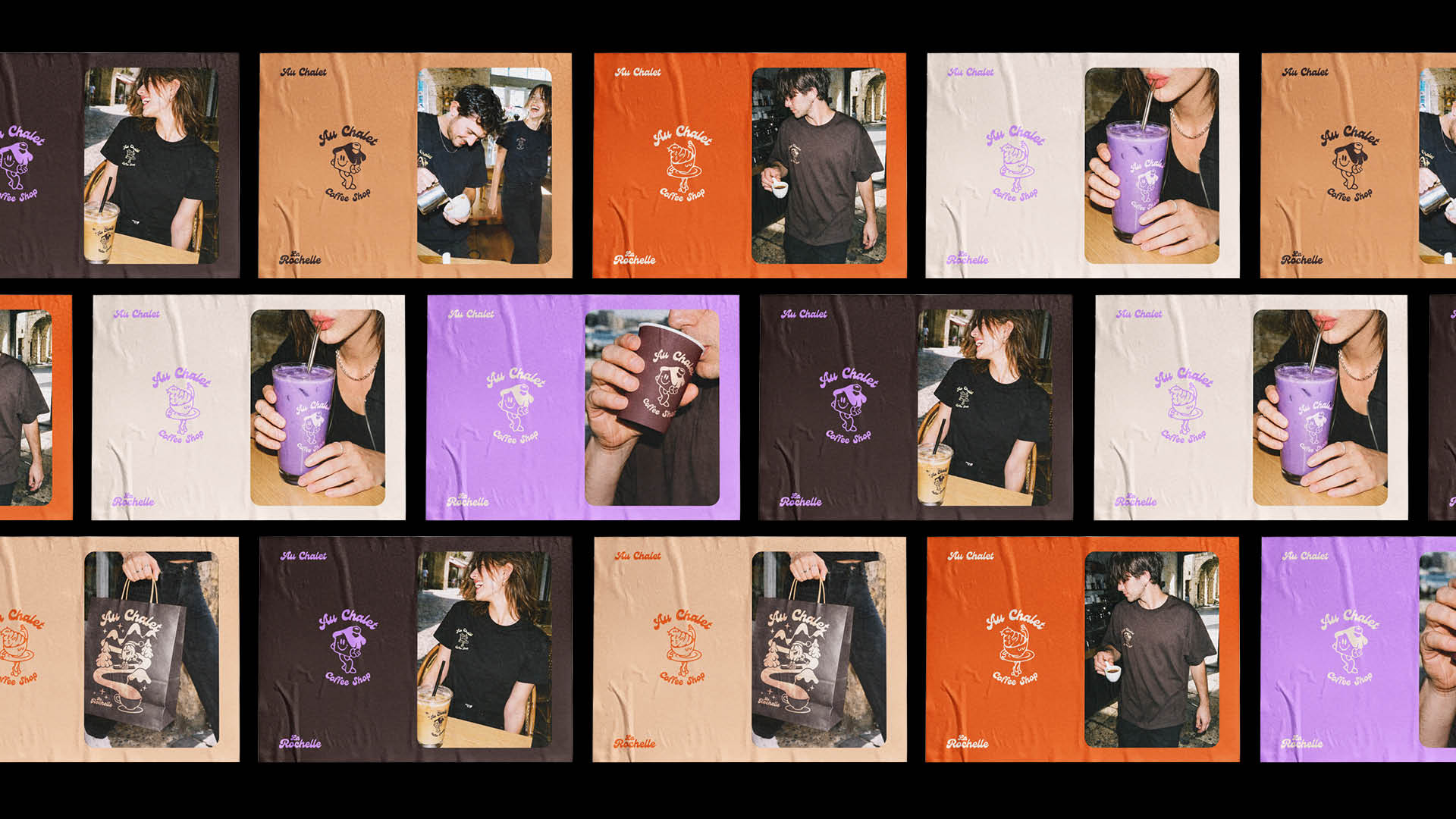
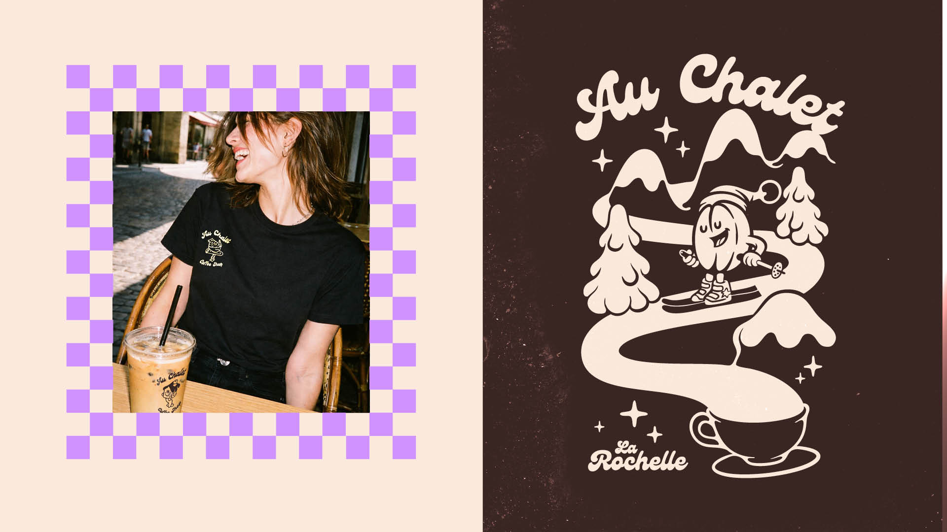
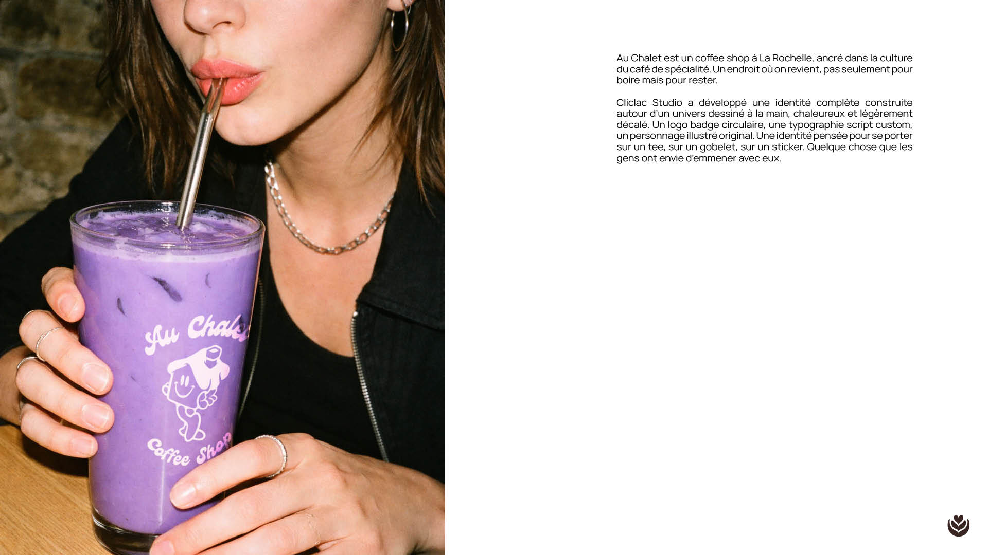
Au Chalet is a coffee shop in La Rochelle, rooted in the warm, unhurried culture of specialty coffee. A place where people come back, not just to drink but to stay. Cliclac Studio developed a complete brand identity built around a hand-drawn world, warm and slightly offbeat. The logo is a circular badge, immediately recognizable, combining a custom script logotype with an original illustrated character, a little creature caught mid-action, somewhere between a coffee bean and a cartoon figure. Friendly, slightly absurd, impossible to forget. The illustration system extends the universe across every touchpoint: a full-scene artwork for the back of the tee, stickers, cups, bags, and social content. Each piece lives in the same visual world, dark chocolate brown as the primary color, softened by cream, lilac and warm orange. The palette is deliberate: rich without being heavy, playful without being childish. The identity was designed to wear well. On a tee, on a takeaway cup, on a sticker stuck to a laptop. Something people want to carry with them.

Voir le cas d'étude
Au Chalet, visuel de couverture
Au Chalet, aperçu 2
Au Chalet, aperçu 3
Au Chalet, aperçu 4

Projet 02

Wave

Coastal Safety & Rescue · Civic & Social

Brand identity for a coastal lifeguard association redefining what civic safety looks like. Young, wearable, built to last beyond the beach.

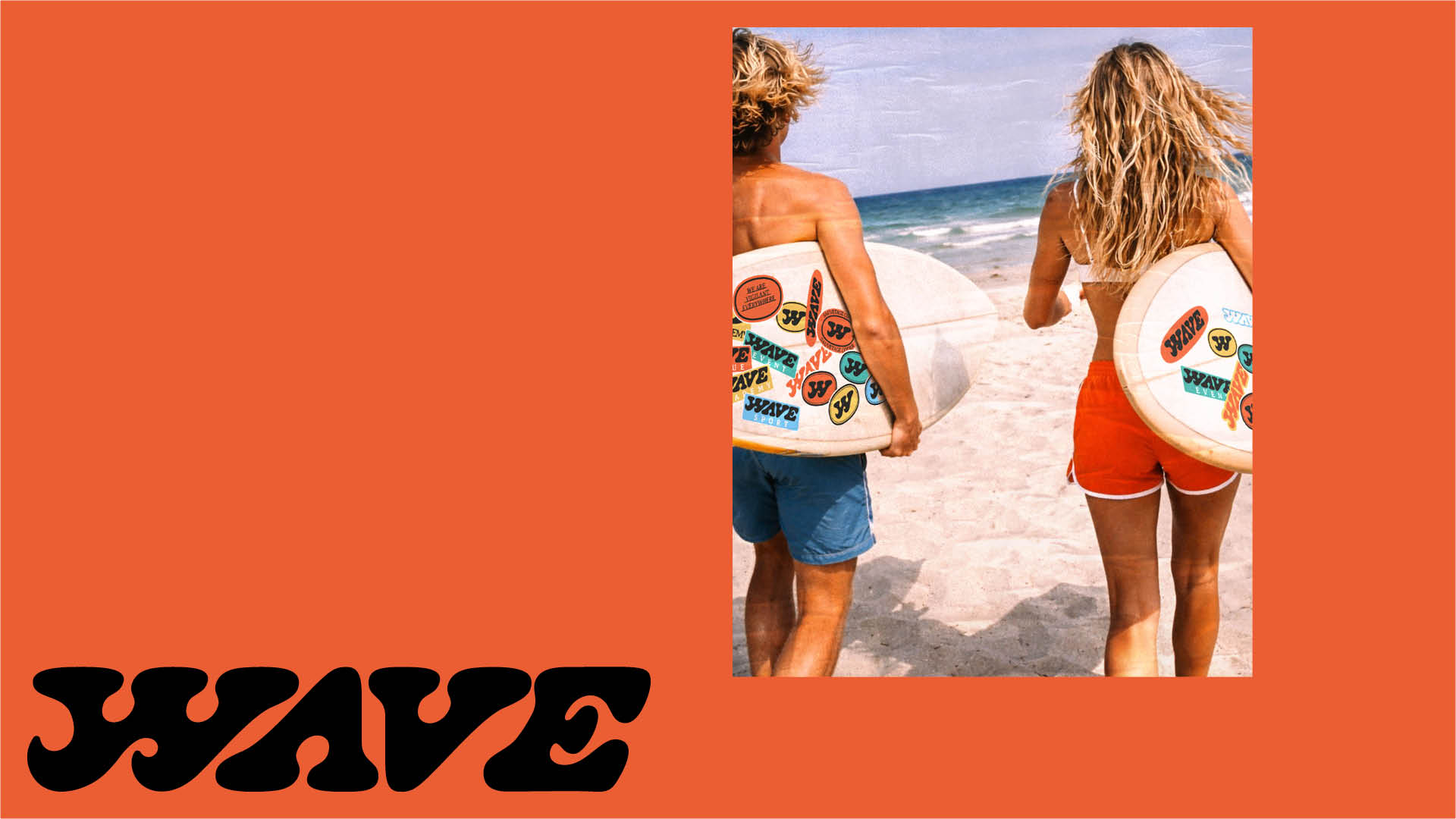
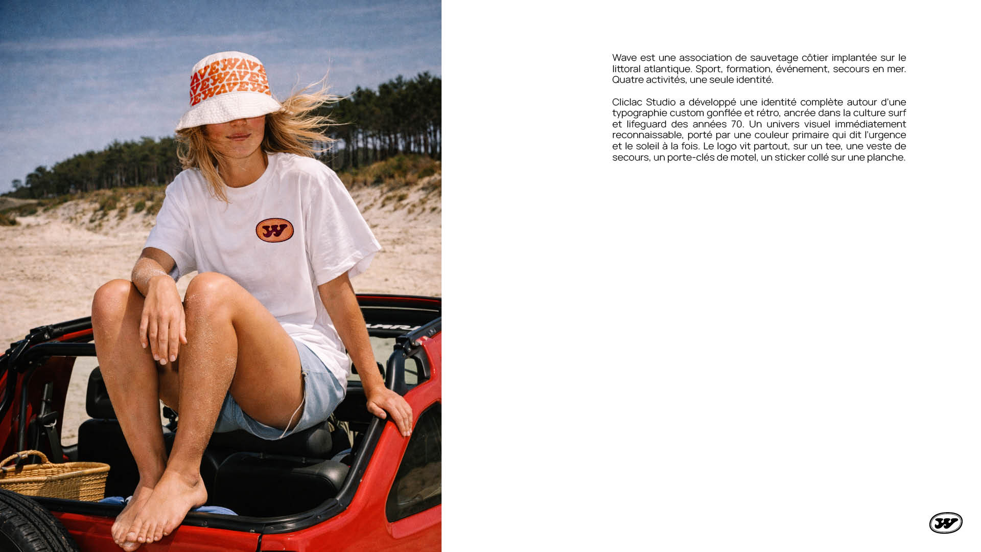
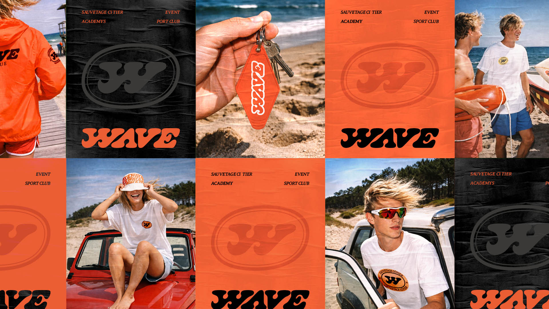
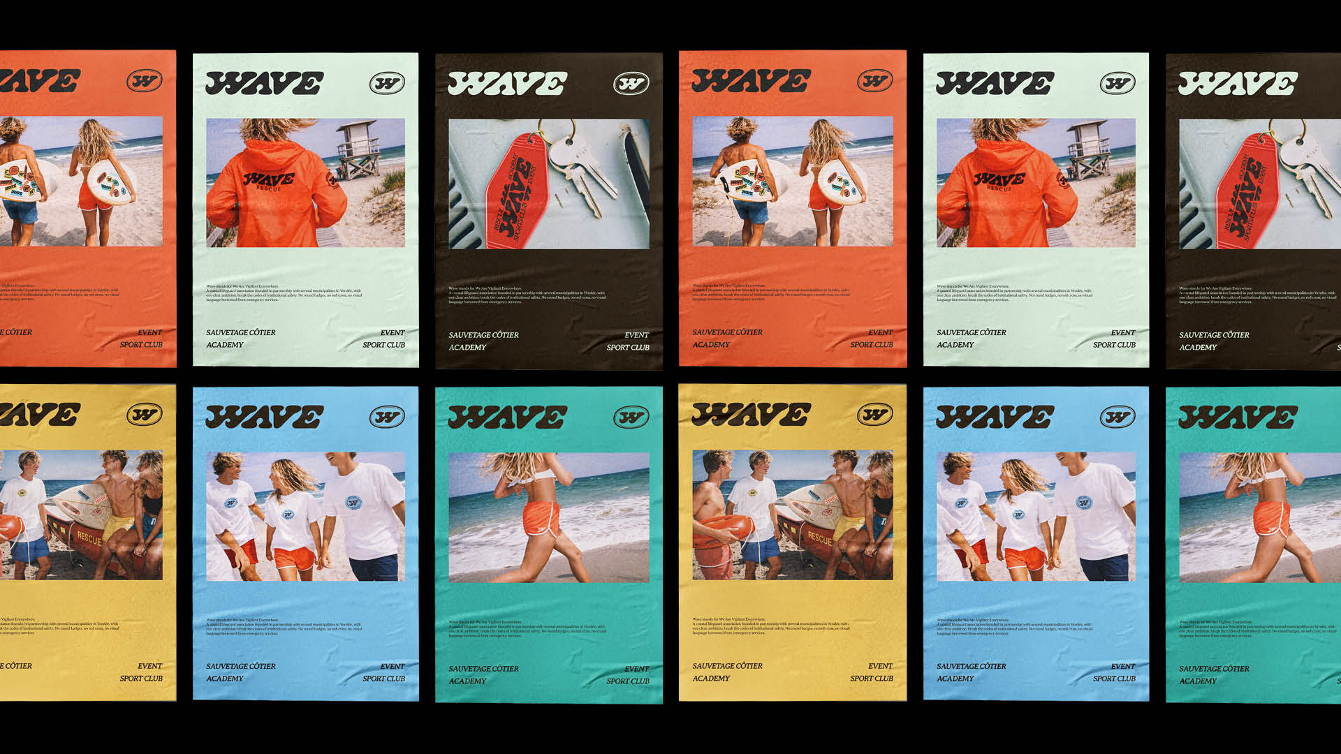
Wave stands for We Are Vigilant Everywhere. A coastal lifeguard association founded in partnership with several municipalities in Vendée, with one clear ambition: break the codes of institutional safety. No round badges, no red cross, no visual language borrowed from emergency services. The identity was built as a system from the ground up. Four distinct entities under a single umbrella: rescue, sport, academy, and events. Each branch holds its own visual territory while remaining unmistakably Wave. The direction is young and kinetic, designed to live on a jersey as naturally as on a signage panel. Merch was a strategic choice, not a byproduct, the kind of attachment that turns visibility into advocacy. Wave doesn't look like a lifeguard association. That was the point.

Voir le cas d'étude
Wave, visuel de couverture
Wave, aperçu 2
Wave, aperçu 3
Wave, aperçu 4

Projet 03

Carré vert

Volleyball · Sport

Brand identity and naming for a Parisian outdoor volleyball club.

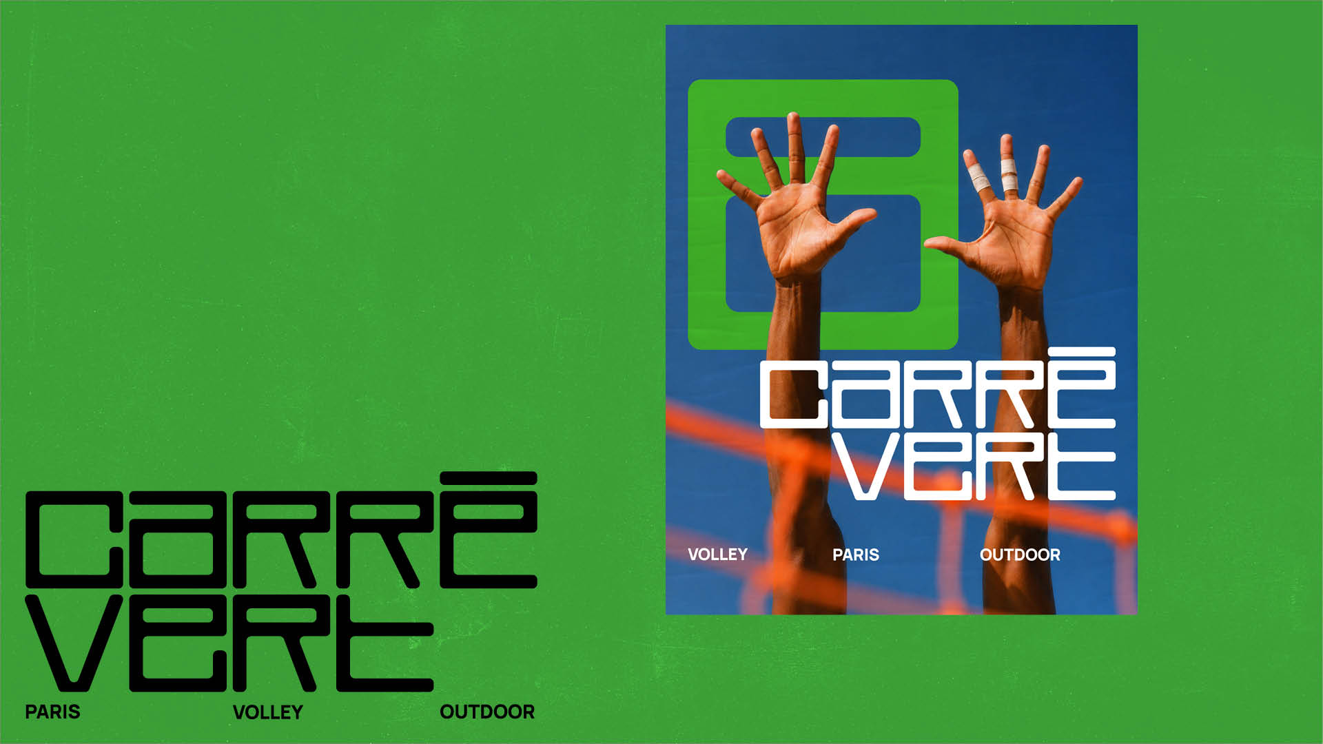
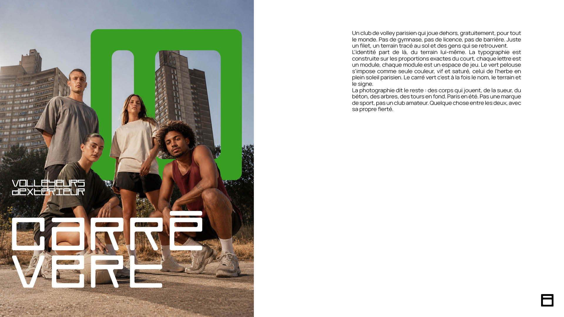
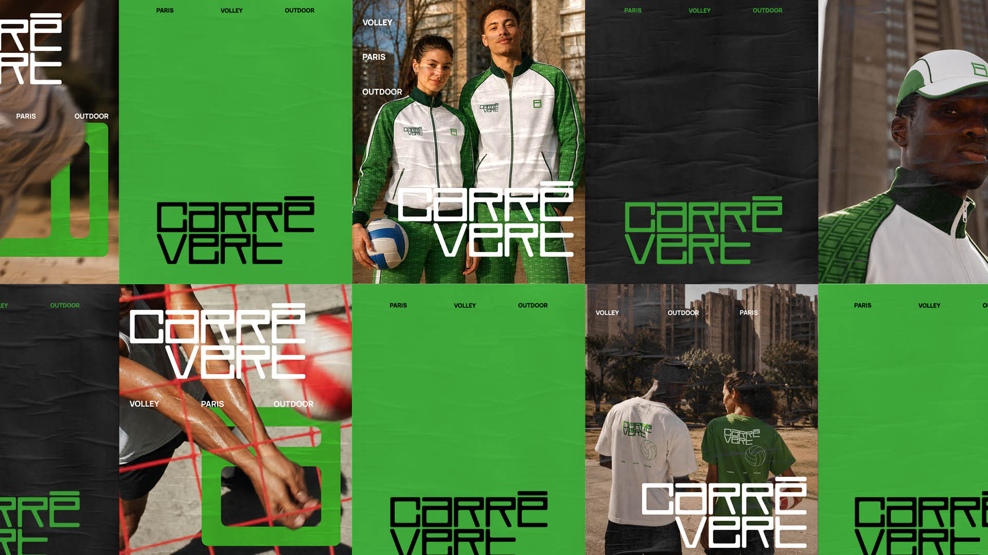
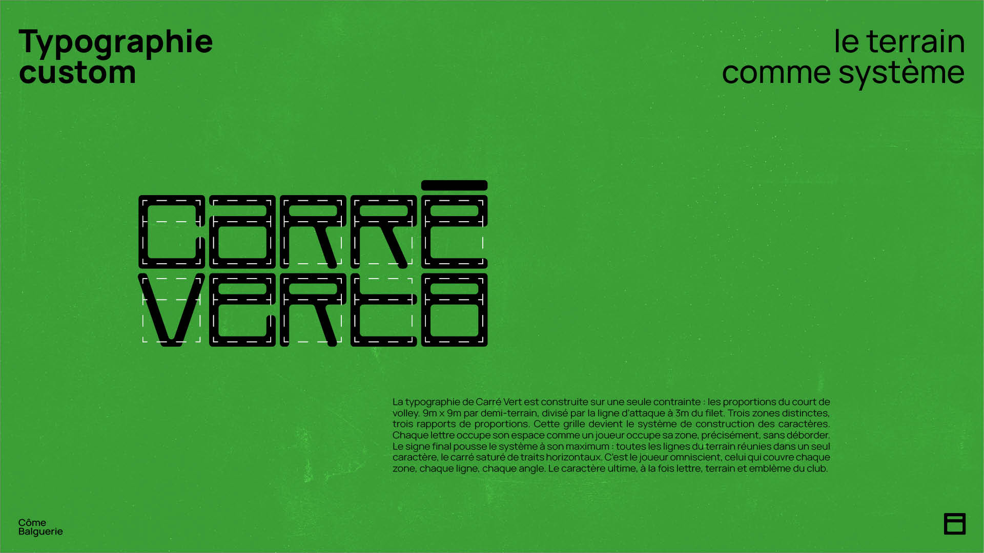
Carré Vert is a Parisian outdoor volleyball club, free, open to all, nomadic. No gym, no license, no barrier. Just a net, a court drawn on the ground, and people who show up. Cliclac Studio partnered with Carré Vert to develop a complete brand identity, starting from the name itself. The existing name described without resonating. The new name, Carré Vert, does both, two words that say the court, the color, and the intention. Paris Volley Outdoor completes the picture. The custom typeface is built on a single constraint: the exact proportions of a volleyball court. 9m x 9m per half-court, divided by the attack line at 3 meters from the net. Three distinct zones, three proportional ratios. These relationships become the grid from which each character is constructed. Every letter occupies its space the way a player occupies their zone, precisely, without overstepping. The final mark pushes the system to its limit: every line of the court compressed into a single glyph, a square saturated with horizontal strokes. It is the player who covers every zone, every line, every angle. A letterform, a court, and a club emblem at once. The brand color is an unambiguous grass green, vivid, saturated, the green of freshly cut grass under a Parisian summer sun. Not the institutional green of sports federations. Not the fluorescent green of technical gear. A green that holds as well on a jersey as on a screen, in full light or in shadow. It marks territory without explaining itself. The art direction follows the same logic: editorial, urban, unpolished. Low angles, hard midday light, brutalist towers in the background. Bodies at play, not athletes posing. Paris in summer.

Voir le cas d'étude
Carré vert, visuel de couverture
Carré vert, aperçu 2
Carré vert, aperçu 3
Carré vert, aperçu 4

Projet 04

Kouzina

Brand design · Restoration

Brand identity for a fine Algerian pastry house in Paris, rooted in family heritage.

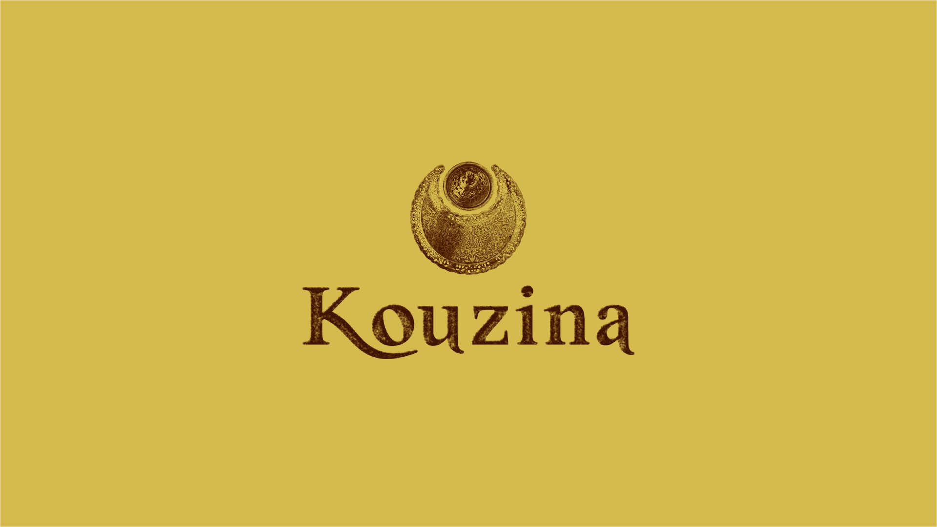
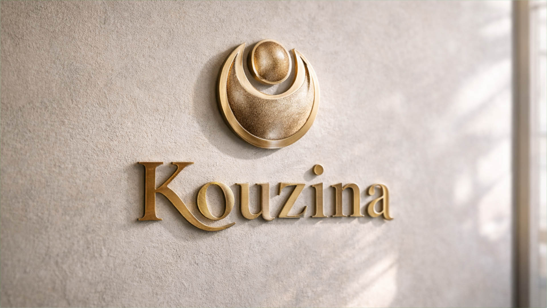
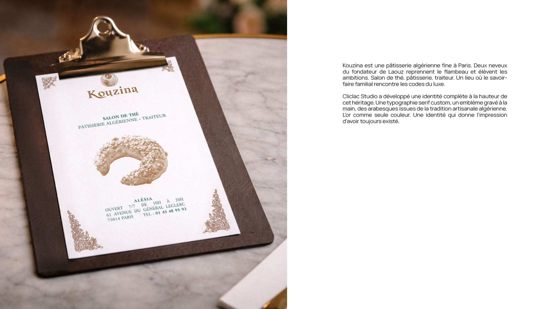
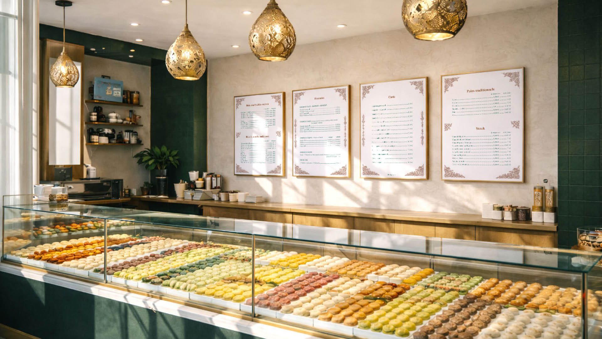
Kouzina is a fine Algerian pastry house in Paris. Two nephews of the founder of Laouz take on the legacy and raise the ambition. Salon de thé, pâtisserie, traiteur. A place where a family tradition meets the codes of luxury. The identity is built to carry that heritage without being crushed by it. A custom serif logotype drawn from calligraphic and manuscript traditions, a hand-engraved emblem inspired by Algerian metalwork and lunar motifs, arabesques rooted in North African craft. Gold as the only color, against ivory and forest green. An identity that feels like it has always existed.

Voir le cas d'étude
Kouzina, visuel de couverture
Kouzina, aperçu 2
Kouzina, aperçu 3
Kouzina, aperçu 4

Projet 05

Plany

Branding, illustration, product design · SaaS / HR & Event Management

A cohesive visual identity combining expressive illustrations with a clear interface system, bringing humanity and accessibility to HR and event management software.

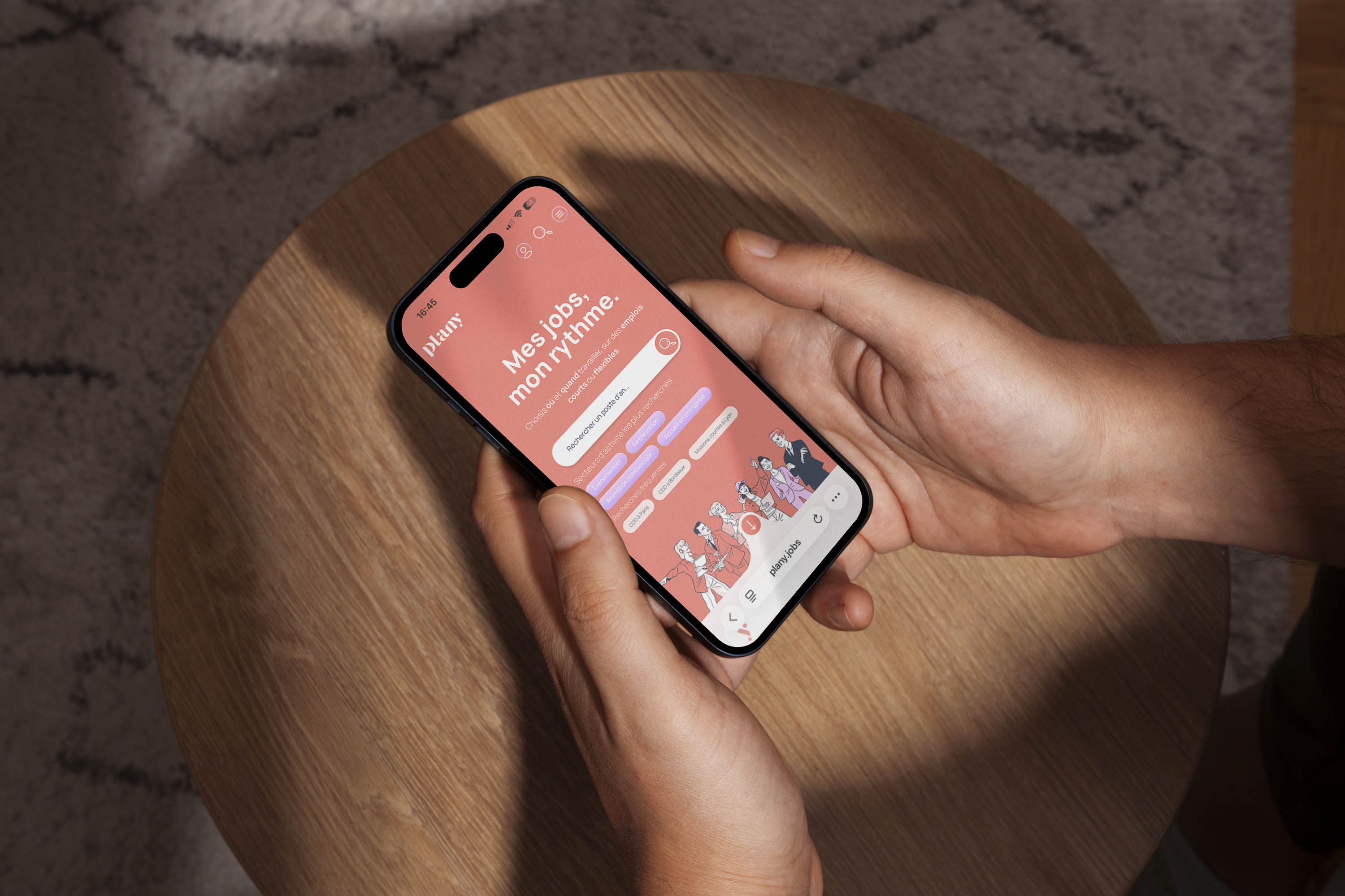
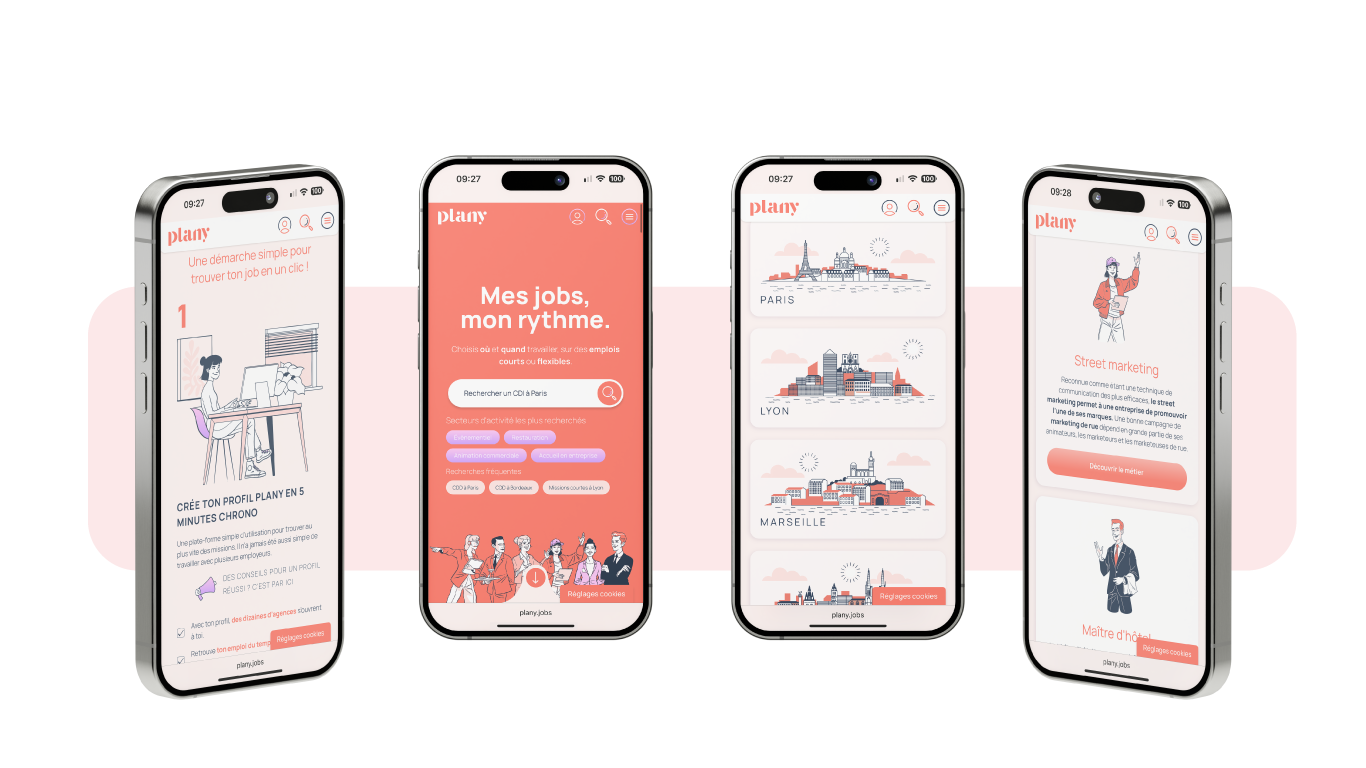
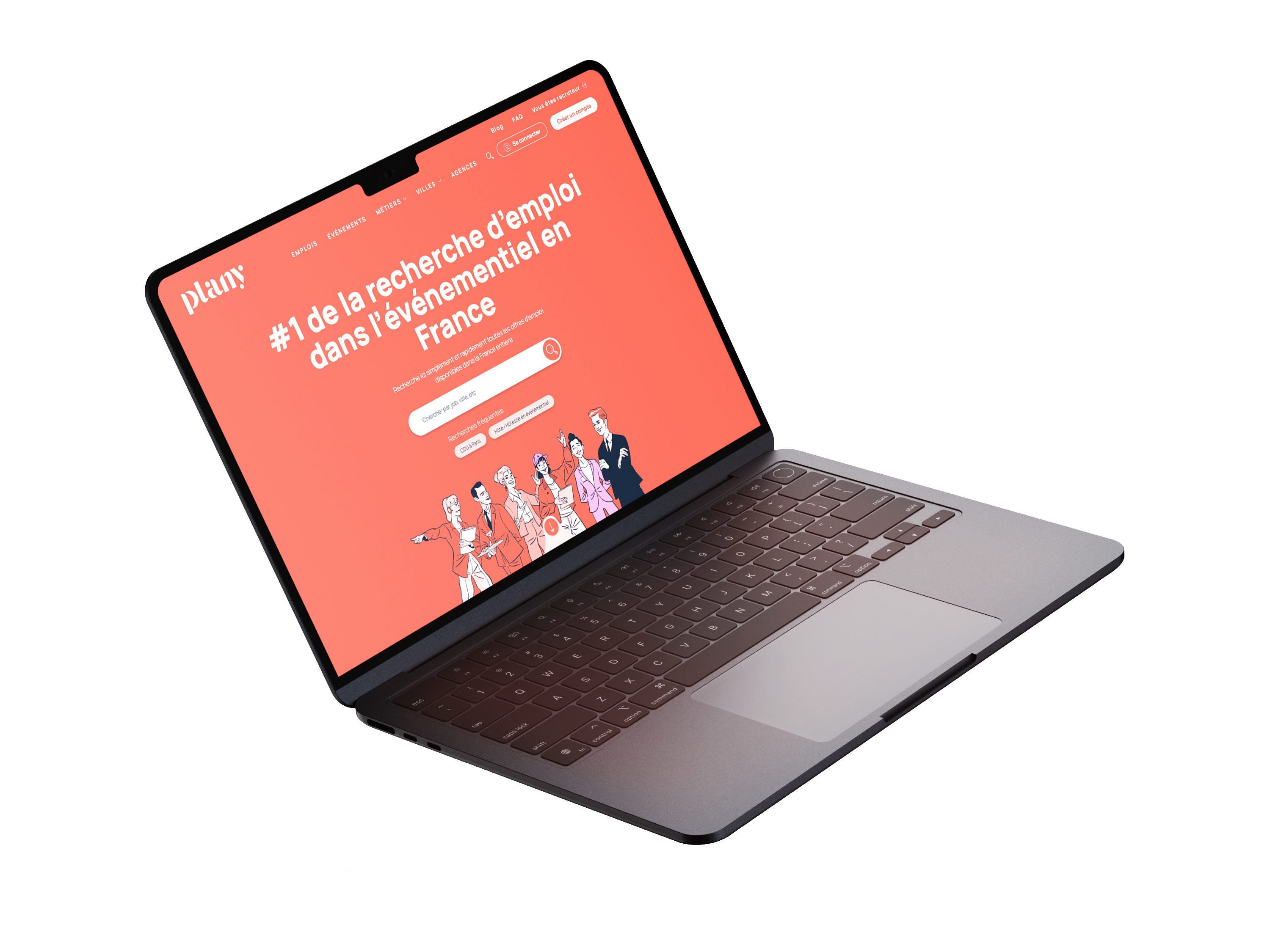
I developed a comprehensive visual universe for Plany, an HR management and recruitment platform built for the events industry. The challenge: create an art direction that feels approachable and engaging while maintaining the clarity and functionality required by complex software. The work centers on a clean visual language paired with expressive character illustrations. Intentionally stylized figures showcase diverse profiles and usage scenarios, bringing a human dimension to a functional platform. The existing color palette of warm and cool tones was refined to reinforce interface legibility while asserting a strong visual identity. The compositions balance structural rigor with spontaneity, echoing both planning and organizational principles core to the sector. This directional approach extends across product interfaces and communication materials, creating a fluid and immediately recognizable experience. A project at the intersection of product design and illustration, developed with my Cliclac Studio approach: simplifying without sacrificing, and making everyday tools visually desirable.

Voir le cas d'étude
Plany, visuel de couverture
Plany, aperçu 2
Plany, aperçu 3
Plany, aperçu 4

Projet 06

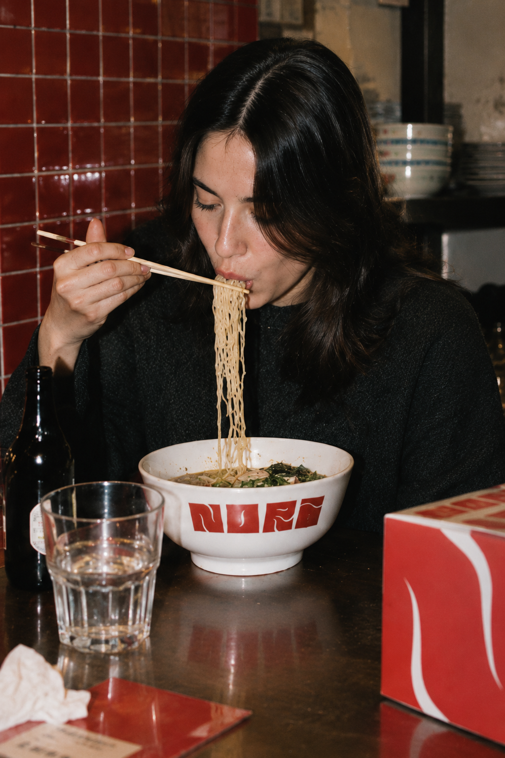
Nori Nori

Branding, art direction, packaging design · Food & beverage / Restaurant

Creating a bold, graphic visual identity for a Paris-based ramen restaurant that captures Japanese street food energy while remaining contemporary and memorable, deployed across packaging, signage, textiles and restaurant environments.

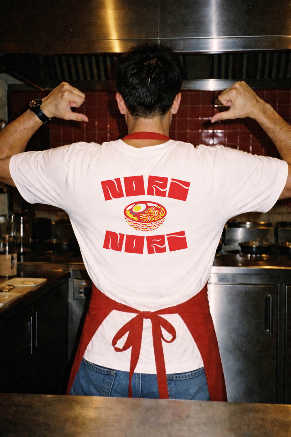
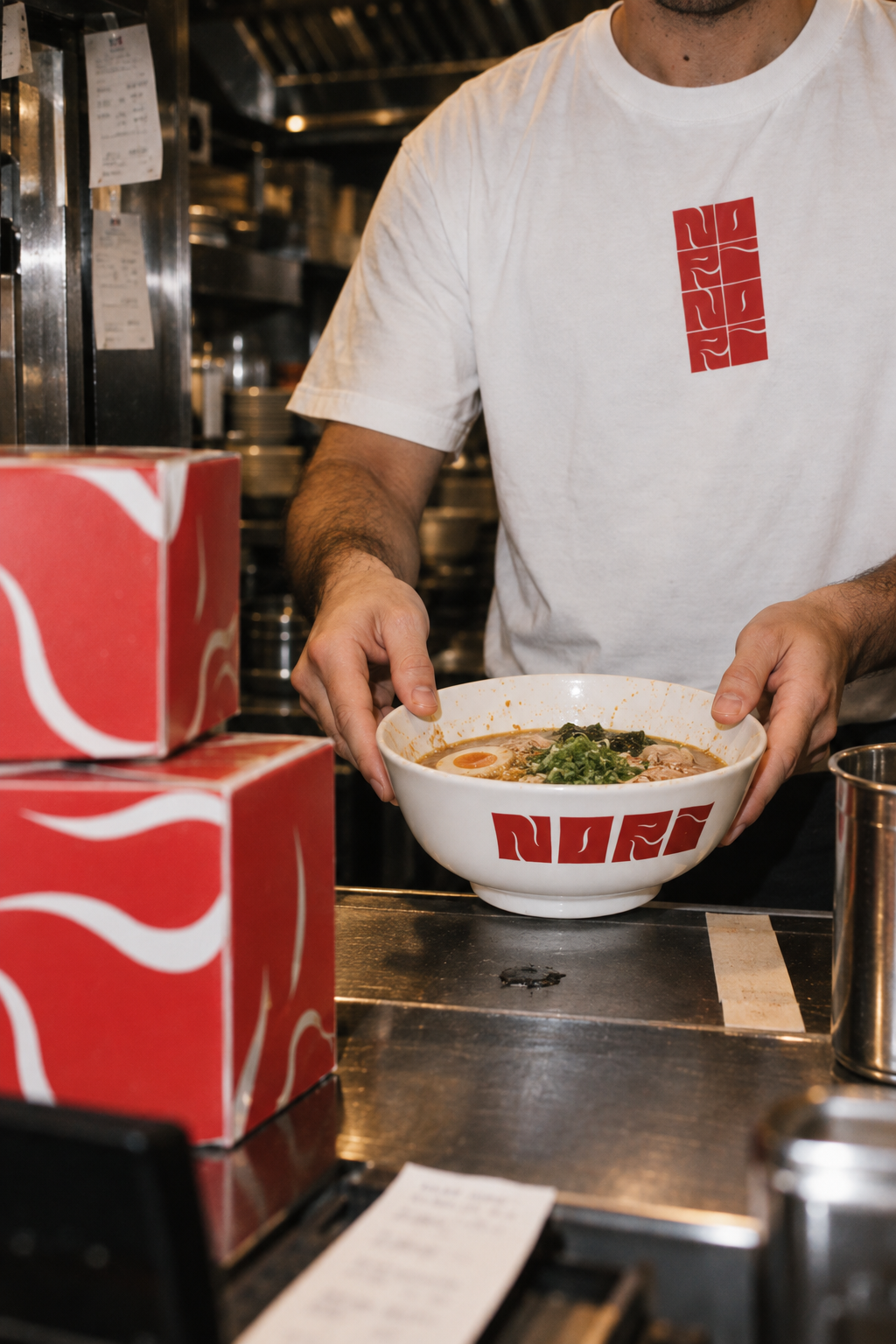
I developed a distinctive visual universe for Nori Nori that translates the vibrant energy of Japanese street food into a cohesive brand language. The challenge: build an identity that feels both authentic to ramen culture and distinctly memorable in a competitive market. The graphic system centers on a modular pattern inspired by kitchen tiles and ramen steam swirls, creating an organic visual rhythm. These flowing forms evoke warmth, movement and generosity, while a structured grid recalls professional kitchens. The system extends across all touchpoints: packaging, signage, textiles and restaurant fixtures. A bold red and white palette anchors the identity with directness and impact, reinforcing the street and pop sensibility of the space. For brand imagery, I developed a photographic aesthetic inspired by early 2000s flash photography: raw, nocturnal and immersive, as if captured in the live energy of the restaurant itself.

Voir le cas d'étude
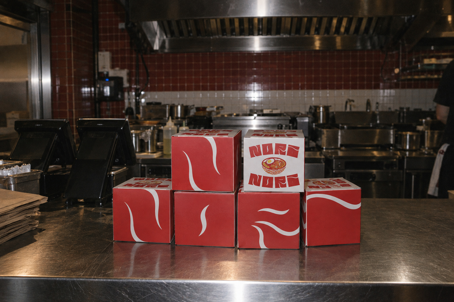
Nori Nori, visuel de couverture
Nori Nori, aperçu 2
Nori Nori, aperçu 3
Nori Nori, aperçu 4

Projet 07

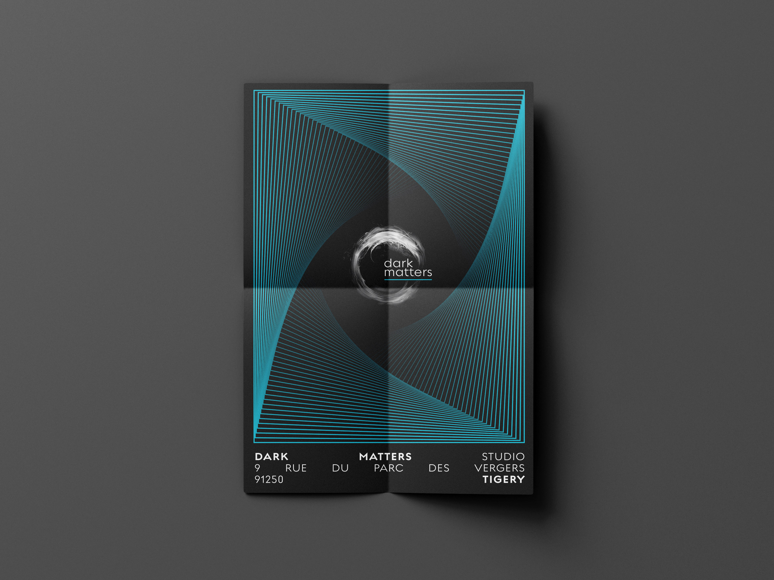
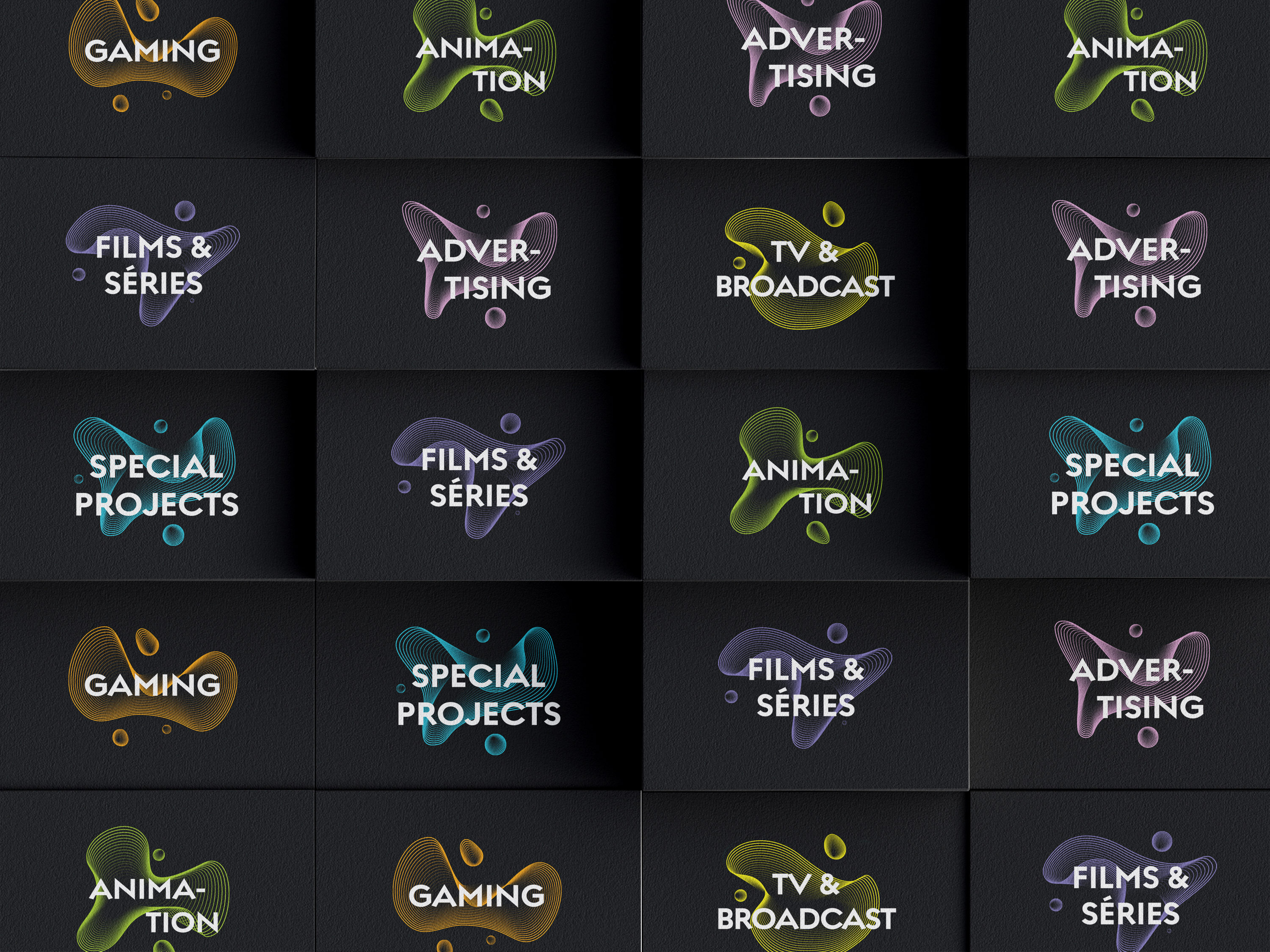
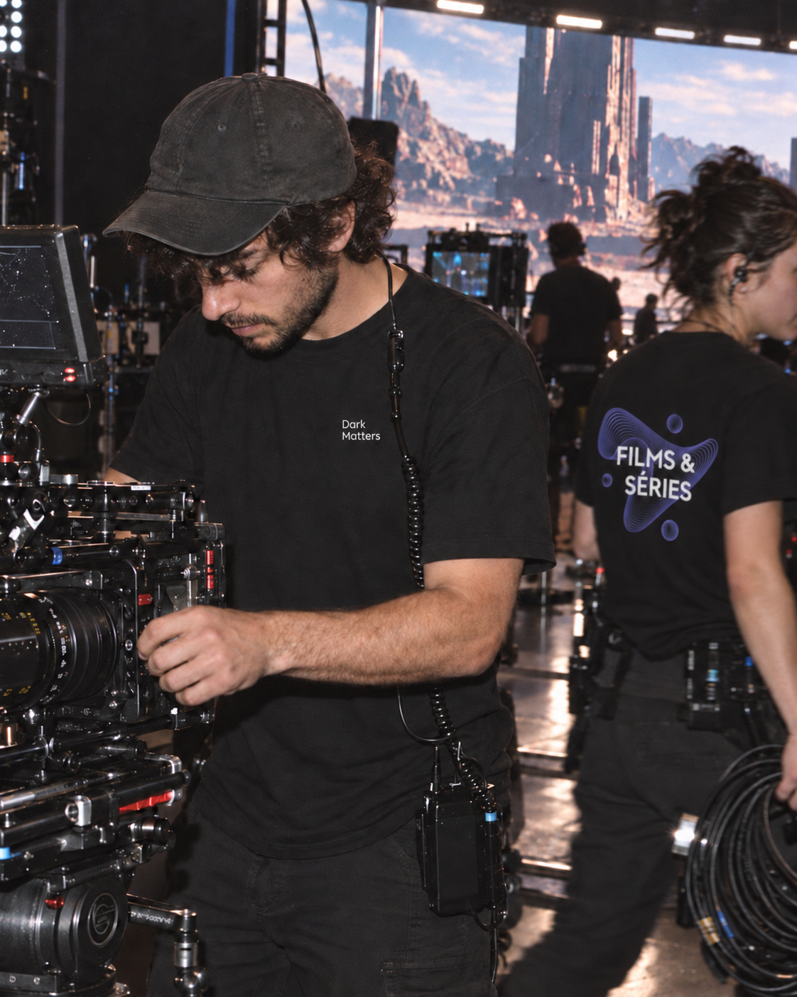
Dark Matters

Art direction, branding, audiovisual production · Audiovisual production & Creative technology

Designing an art direction at the intersection of technology and visual storytelling, a generative graphic system built on fluid forms that evokes data flows, immersive environments and dimensional depth.

I developed a comprehensive visual universe for Dark Matters, grounded in their expertise across the entire production pipeline. The challenge: translate the complexity of their technical mastery into an elegant, contemporary aesthetic that works across multiple formats. The system relies on fluid, generative shapes and dynamic compositions, tension lines, luminous gradients and layered depth that create a sense of movement and immersion. Every visual component is designed to convey sophistication while remaining modular enough to accompany the diversity of their productions, from film to animation to specialized projects. The result is a cohesive graphic language that functions as an immersive entry point into their world, translatable across print and digital applications while maintaining visual consistency and impact.

Voir le cas d'étude
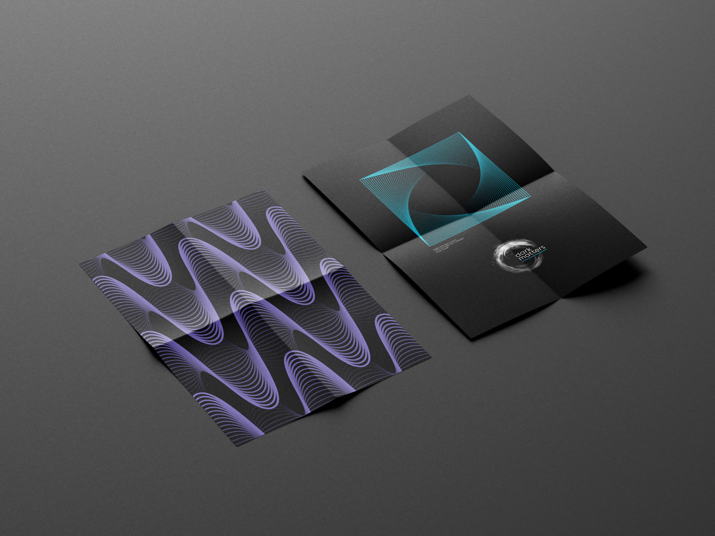
Dark Matters, visuel de couverture
Dark Matters, aperçu 2
Dark Matters, aperçu 3
Dark Matters, aperçu 4

Projet 08

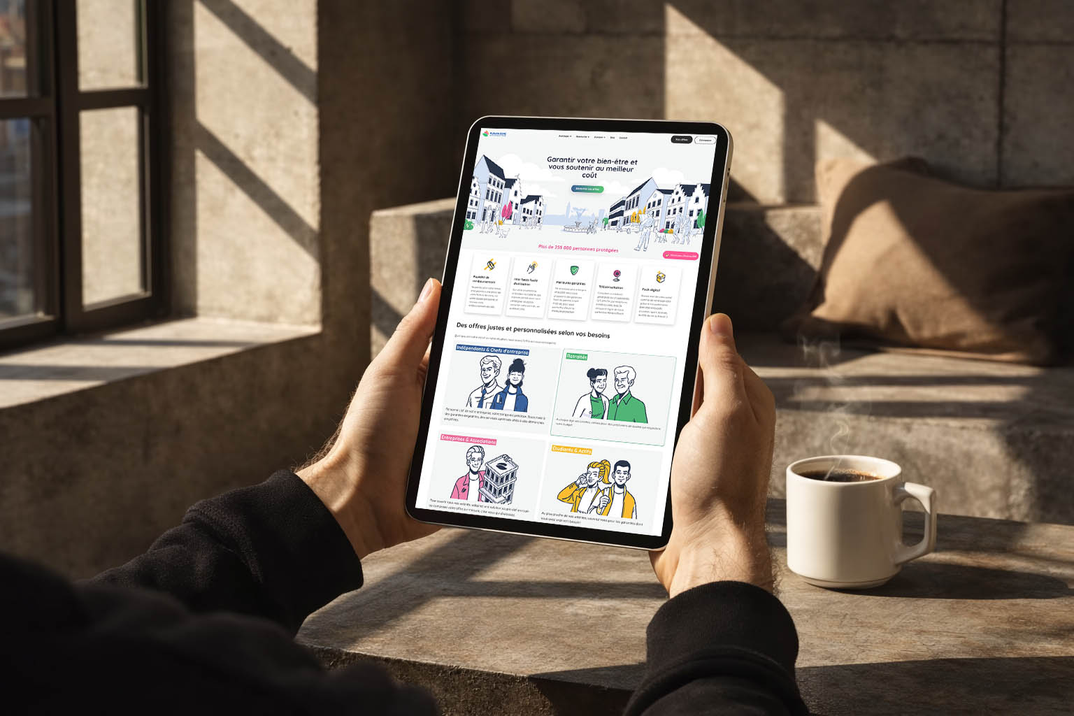
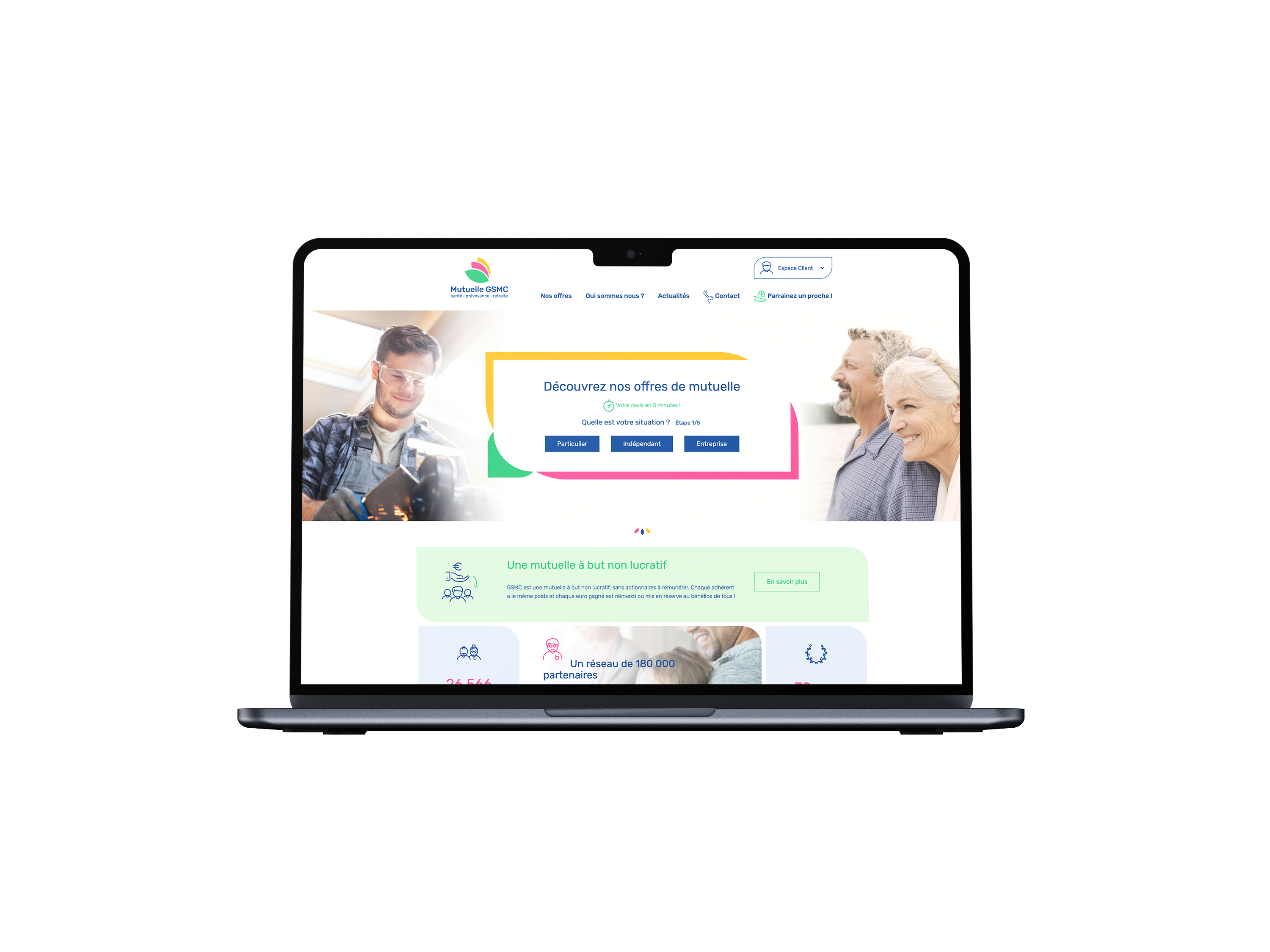
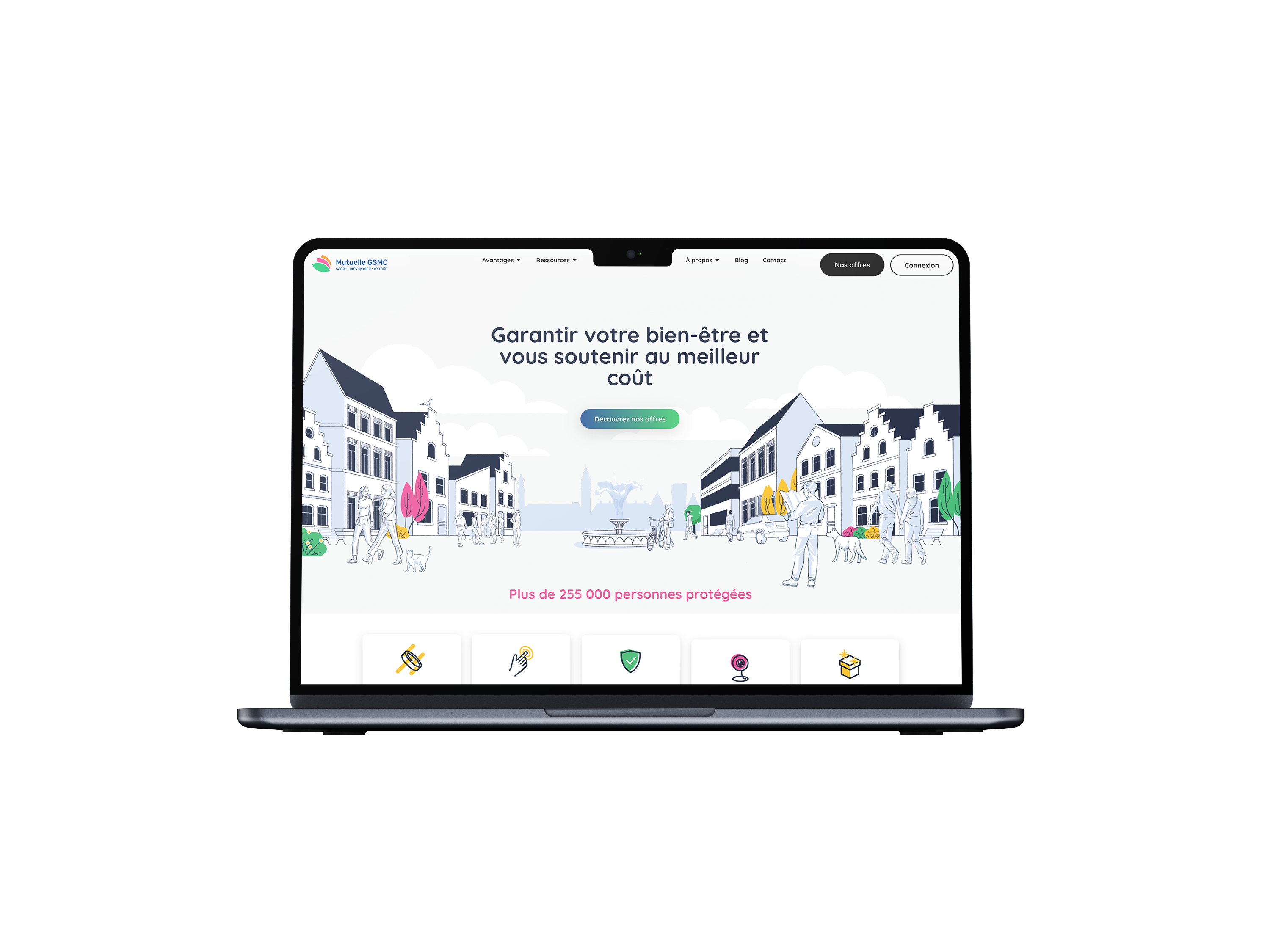
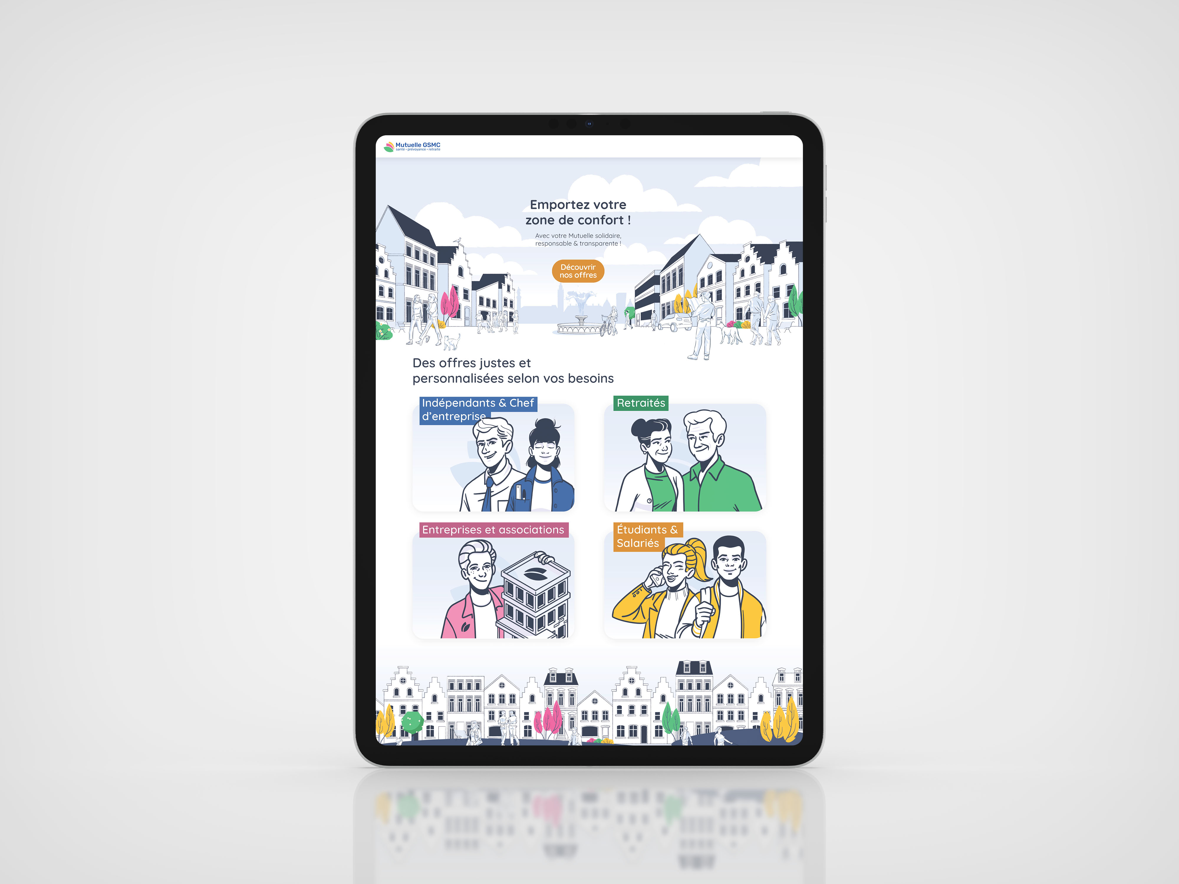
Illustrated universe for Mutuelle GSMC

Art direction, illustration, product design · Insurance / Mutual

Imaginer une noCreating a strong visual identity capable of embodying the human values and proximity of a mutual insurance company, through illustrations, pictograms and characters designed to reinforce message clarity and brand distinctiveness.uvelle identité visuelle forte, capable d’incarner l’engagement et la proximité de la marque

I guided Mutuelle GSMC in creating a custom illustrated universe, aligned with their graphic charter and values. The challenge: imagine a new visual identity capable of embodying the company's commitment and proximity, moving away from expected visual codes in the insurance sector.

Voir le cas d'étude
Illustrated universe for Mutuelle GSMC, visuel de couverture
Illustrated universe for Mutuelle GSMC, aperçu 2
Illustrated universe for Mutuelle GSMC, aperçu 3
Illustrated universe for Mutuelle GSMC, aperçu 4

Une marque avec du caractère, c'est pas une option, c'est le point de départ.

Un projet en tête ?

Écris-nous quelques lignes : contexte, envies, échéance. On répond vite et on adore les idées neuves.